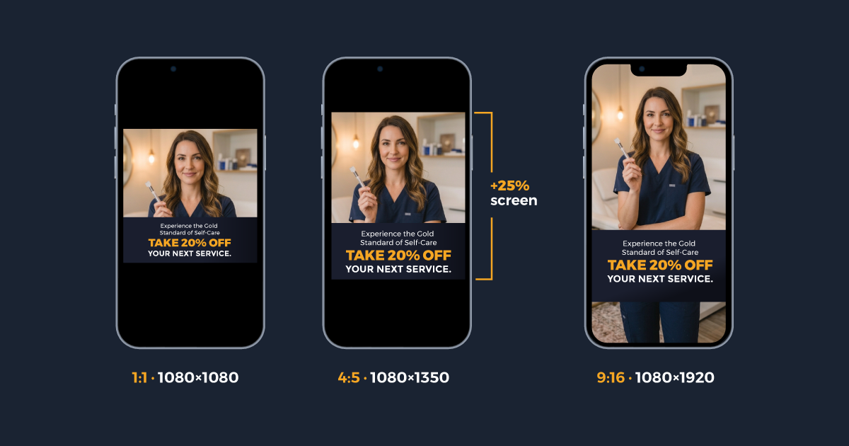
You uploaded a beautiful Botox ad. Provider photo, offer text, clear CTA. The creative looked perfect on your desktop. Then it went live and Meta cropped the bottom third off in Stories, buried the phone number behind the CTA button in Reels, and squeezed the whole thing into a square on Feed. The ad spent $400 before anyone noticed.
This happens to med spas constantly. The image sizes Meta recommends in its help docs, the dimensions its upload flow defaults to, and the way its placements actually render are three different things. Most agencies upload a single 1:1 square and call it done. The result is creative that technically runs but visually fails on the placements that matter most.
This guide covers the exact sizes, safe zones, and export specs that produce med spa ads people actually see. No outdated screenshots from 2023 blog posts. No generic advice. Just the numbers that apply right now in 2026. For a full look at how we run Facebook and Instagram campaigns for med spas, see our Meta Ads page.
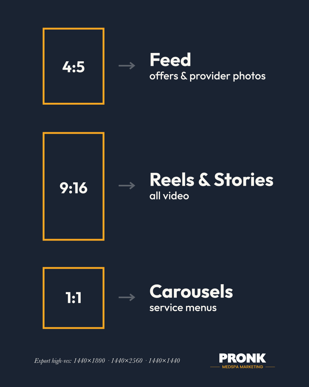
The three sizes that matter in 2026
Meta supports dozens of aspect ratios. You need three.
| Ratio | Pixels | Placement | Med spa use case |
|---|---|---|---|
| 4:5 | 1080 x 1350 | Facebook Feed, Instagram Feed | Provider photos, offer announcements, before/after results |
| 9:16 | 1080 x 1920 | Reels, Stories | Video testimonials, treatment demos, booking urgency |
| 1:1 | 1080 x 1080 | Carousels, Marketplace | Service menus, multi-treatment showcases |
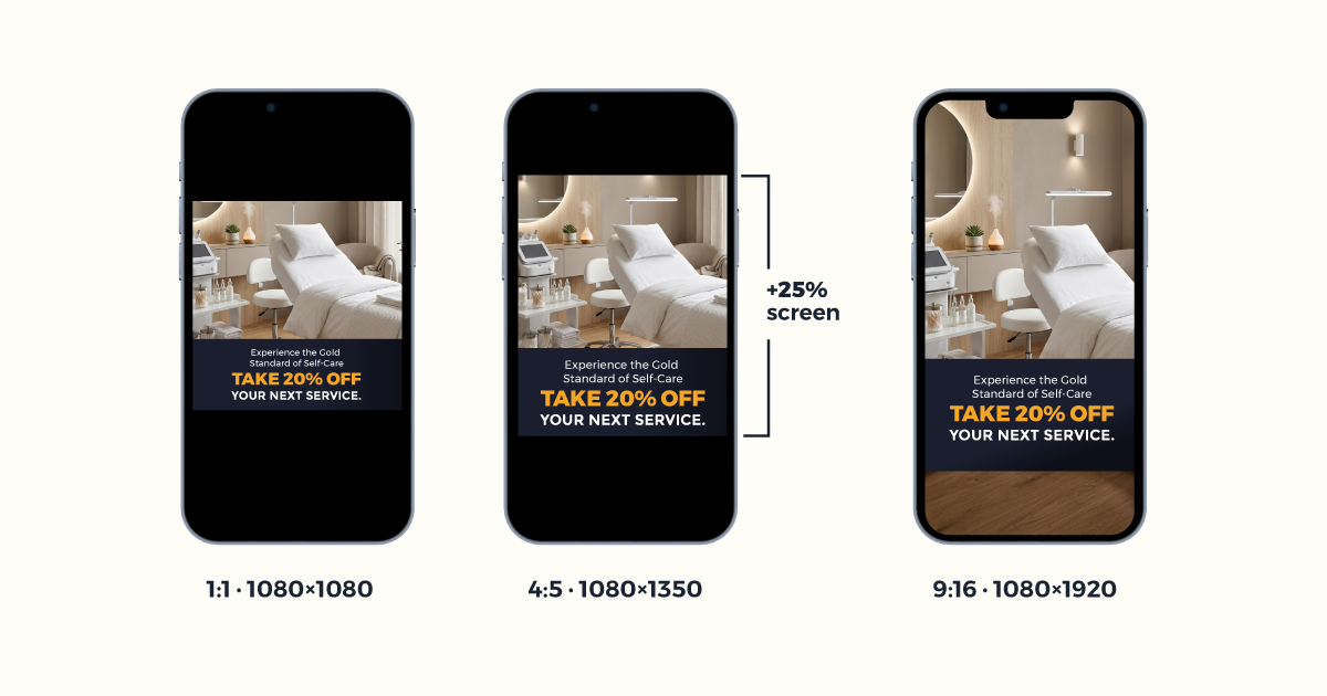
The 4:5 ratio dominates Feed because it takes up roughly 25% more screen space than a 1:1 square. On a phone, that extra vertical real estate is the difference between a patient pausing to read your offer and scrolling past it. Every percentage point of screen coverage translates to stopping power in a feed where you compete against friends, family, and fifty other advertisers.
The 9:16 ratio is mandatory for Reels and Stories. These are full-screen placements. Uploading anything shorter than 9:16 forces Meta to add black bars or zoom-crop your image, and either option looks unprofessional. If your practice runs video content (and it should), 9:16 is the native format.
The 1:1 square survives for one placement: Carousels. When you build a swipeable service menu or a multi-treatment showcase, the square format keeps each card uniform and scannable. Some practices also use 1:1 for Marketplace placements, but Marketplace drives minimal patient volume for med spas compared to Feed and Reels. Outside of Carousels, avoid it.
The March 2026 safe zone change (and why it matters for Reels)
Meta rolled out a unified safe zone for Stories and Reels in early 2026. Before this change, Stories and Reels had separate overlay regions. Now they share one set of exclusion zones.
The numbers:
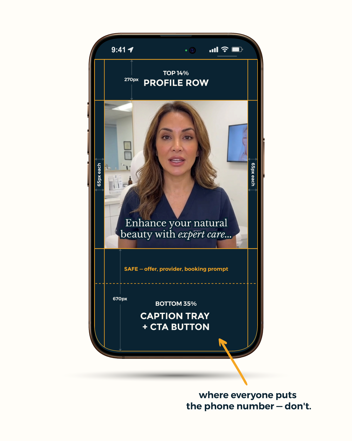
- Top 14% (about 270px on a 1920px canvas): The profile row. Your account name, avatar, and the follow button sit here. Any text or important visual element placed in this zone disappears behind the interface.
- Bottom 35% (about 670px): The caption tray and CTA button. This is the single biggest creative killer for med spa ads. Practices put their phone number, booking link, or offer details in the bottom third of the image. Meta covers all of it.
- Sides, 6% each (about 65px per side): Edge padding. Less destructive than top and bottom, but still enough to clip text that runs to the margins.
The safe zone for your actual content sits in the middle band, roughly between the 15% and 65% marks of the canvas. That is where your provider's face, your offer headline, and your treatment name need to live.
We see med spas lose money on this every week. A Reels ad for CoolSculpting with "Book Now, Save $500" in the bottom quarter of the frame. A Stories ad with the provider's face half-hidden behind the profile row. The creative was designed for a flat canvas. Nobody checked how it renders with the interface layered on top.
The fix is straightforward. Open your 9:16 canvas in whatever design tool you use. Draw horizontal guides at 270px from the top and 670px from the bottom. Draw vertical guides at 65px from each side. Everything inside those guides is visible. Everything outside is covered by Meta's interface. Design within the box.
The upload screen is lying to you
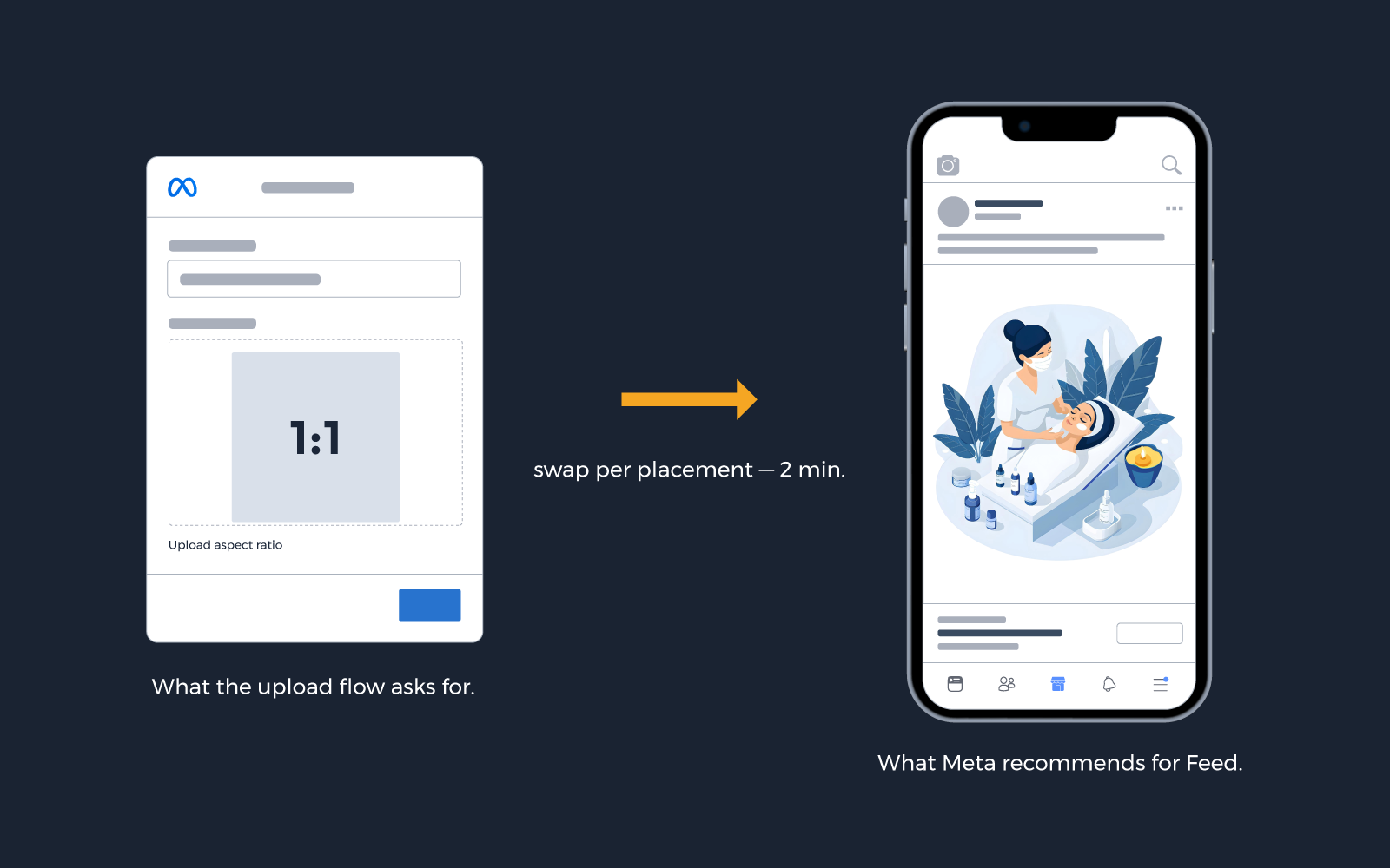
Open Ads Manager and create a new ad. The upload flow will ask for a 1:1 image. It shows you a square crop preview. It does not tell you that uploading a 1:1 image to Feed, Stories, and Reels simultaneously means Meta will reformat your creative for every non-square placement.
Here is what to do instead.
Go to the ad level in Ads Manager and look for "Asset Customization" or "Edit Placement" in the creative section. This lets you upload separate images for different placement groups. Upload your 4:5 for Feed. Upload your 9:16 for Reels and Stories. Upload your 1:1 only if you are running Carousels.
This is not extra work. It is the intended workflow. The upload screen defaults to 1:1 because it needs a single format that technically displays everywhere. But "technically displays" and "performs well" are different outcomes. The practices getting results from Meta ads are the ones uploading placement-specific creative, not the ones relying on Meta's auto-crop.
Med spa placement guide: which size goes where
| Placement | Size | Ratio | Med spa use case |
|---|---|---|---|
| Facebook Feed | 1080 x 1350 | 4:5 | Offer ads, provider intros, treatment education |
| Instagram Feed | 1080 x 1350 | 4:5 | Before/after posts, seasonal promotions |
| Reels | 1080 x 1920 | 9:16 | Patient testimonials, treatment process videos |
| Stories | 1080 x 1920 | 9:16 | Flash offers, event countdowns, booking reminders |
| Carousels | 1080 x 1080 | 1:1 | Service menus, treatment packages, provider spotlights |
| Marketplace | 1080 x 1080 | 1:1 | Local awareness (lower priority for most med spas) |
The 4:5 default logic is simple: Feed is where most med spa ad dollars go, and 4:5 gives you the most screen real estate in Feed. Med spa patients are high-CPM demographics. You are paying more per thousand impressions than a DTC brand selling socks. Wasting that impression on a small square image when you could fill 25% more of the screen with a 4:5 vertical is money left on the table.
For practices running Advantage+ campaigns (and most should be), Meta will automatically distribute your ads across placements. If you only upload one size, every placement except the one that matches your aspect ratio will get a reformatted version. Upload all three sizes. Let Meta's algorithm choose placements. Give it the right creative for each one.
Ultra-tall phones and Meta's smart zoom
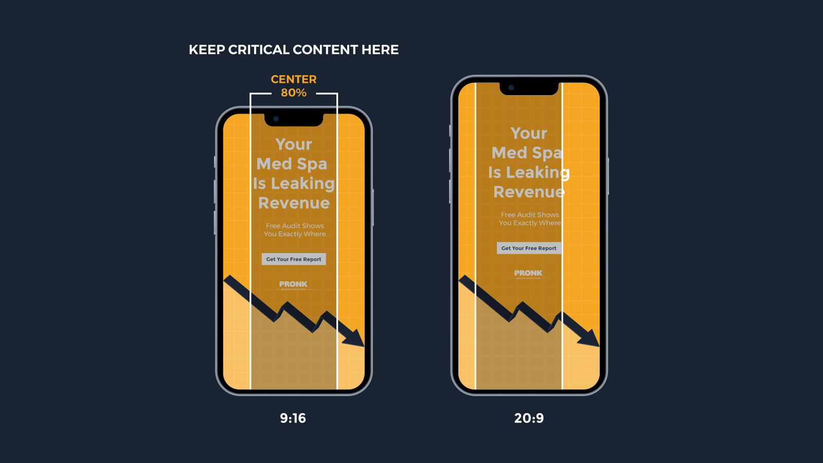
Some phones now ship with 20:9 or even 21:9 aspect ratios. Samsung's Galaxy S series, several OnePlus models, and most gaming phones render taller than the standard 19.5:9 that 9:16 content was designed for.
When a 9:16 ad displays on a 20:9 screen, Meta applies "smart zoom." It scales the image up slightly and crops the left and right edges to fill the taller viewport. On a standard 9:16 canvas, you lose about 10% from each side.
The fix: keep all meaningful content within the center 80% of your 9:16 canvas. Do not place text, logos, or provider faces near the left and right edges. The safe zone rules for top and bottom still apply, so you are really designing for a vertical strip in the center of the frame.
This is the kind of detail that separates an agency running med spa Meta ads from an agency running Meta ads that happen to include a med spa client. Your agency should know about smart zoom. If they do not, ask them.
Export specs your designer needs
Send your designer or creative team these specs. Print them out. Pin them to the wall above the monitor.
File format: PNG for graphics and text-heavy images. JPG (high quality, 90%+) for photography. Either format, under 30MB.
Export resolutions (2x for Retina/high-density screens):
| Ratio | Export size | Use |
|---|---|---|
| 4:5 | 1440 x 1800 | Feed |
| 9:16 | 1440 x 2560 | Reels, Stories |
| 1:1 | 1440 x 1440 | Carousels |
Text placement rules:
- No text in the top 14% or bottom 35% of any 9:16 canvas
- No text or logos within 65px of the left or right edge on vertical creative
- Center the headline and offer in the middle 50% of the frame for safety across all devices
- Logo on every creative, inside the safe zone
Color and contrast: Meta's ad preview tool compresses images. High-contrast text on solid or semi-transparent backgrounds holds up better than thin text over busy photography. If your provider is the background, add a dark gradient overlay behind the text. White or gold text on a navy overlay at 70-80% opacity works consistently across both light and dark mode feeds.
Naming convention: Label files by ratio and campaign for your own sanity. Something like botox-spring-4x5.png and botox-spring-9x16.png saves time when you are uploading multiple sizes per ad set.
Video ad specs for Reels and Stories
Static images still perform, but Reels is where Meta is pushing distribution in 2026. If your practice is not running video creative, you are missing the placement with the lowest CPMs and highest engagement rates on the platform.
Format and duration:
| Spec | Requirement |
|---|---|
| File format | MP4 or MOV (H.264 codec) |
| Max file size | 4GB |
| Duration | 5 to 90 seconds (15 to 30 seconds performs best for med spas) |
| Frame rate | 30fps minimum |
| Audio | Required for Reels. Optional but strongly recommended for Stories |
| Captions | Burned in or auto-generated. 80%+ of mobile users watch with sound off initially |
What works for med spa video ads:
The first 3 seconds determine whether someone watches or scrolls. Open with a hook that is visual, not verbal. A treatment room reveal, a provider holding a syringe with a confident smile, or a quick text overlay with a bold claim ("42 units. 15 minutes. Done.") outperforms a slow logo intro every time.
Structure a 15-second Reels ad like this:
- 0 to 3 seconds: Visual hook with text overlay stating the offer or outcome
- 3 to 10 seconds: Provider speaking directly to camera or treatment environment walkthrough
- 10 to 15 seconds: CTA with urgency element ("Limited spots this month" or "Book before Friday")
Keep all text overlays inside the safe zone. Burned-in captions should sit in the center 50% of the frame vertically, above the bottom caption tray. Meta's auto-caption feature places text too low for Reels. Burn your own.
Vertical video shot on an iPhone in a clean treatment room consistently outperforms polished studio content for med spa Reels ads. Patients respond to authenticity. Your provider talking to camera for 15 seconds in their actual office converts better than a $5,000 production.
Carousel specs and best practices
Carousels are the most underused format in med spa advertising. A carousel lets you show multiple treatments, walk through a process step by step, or present a service menu that patients swipe through like a brochure.
Specs:
| Spec | Requirement |
|---|---|
| Card size | 1080 x 1080 (1:1) |
| Export size | 1440 x 1440 (2x) |
| Cards per carousel | 2 to 10 |
| Headline per card | 40 characters max (truncates on mobile) |
| Description per card | 125 characters max |
High-performing carousel formats for med spas:
- Treatment menu: Each card is one treatment with a name, one-line description, and price range. Works well for practices offering multiple injectables or facial treatments.
- Before/after sequence: Card 1 shows the starting point, cards 2 through 4 show progress, card 5 shows the final result. Only use this format for treatments where Meta allows results imagery. Facials and skin treatments are generally safe. Injectables and body contouring are not. Check HIPAA rules for before-and-after photos before posting any patient imagery.
- Process walkthrough: "What to expect at your first visit." Card 1: consultation. Card 2: treatment plan. Card 3: treatment day. Card 4: results timeline. Card 5: booking CTA.
- Provider spotlight: Introduce your injectors and aestheticians across multiple cards with credentials and specialties.
The first card needs to earn the swipe. If card 1 looks like every other ad in the feed, nobody reaches card 2. Use a bold text overlay or a striking image that creates curiosity. "5 treatments. One visit. Here is what we did." gives the patient a reason to keep swiping.
The compliance layer: do not skip this
Getting the size right does not matter if Meta rejects the ad. Med spa advertising on Meta operates under stricter creative policies than most industries. For a full breakdown of what you can and cannot say, read our HIPAA-compliant advertising guide.
You cannot show before/after images for injectables, body contouring, or weight loss procedures. Meta's automated review flags these and either rejects the ad or restricts its delivery to the point where it barely spends. You cannot show close-ups of "problem skin" (acne, hyperpigmentation, aging) as the primary visual. You cannot show needles entering skin or any image that implies a medical procedure in progress.
What works: provider photos in a clean treatment room. Lifestyle imagery of confident, happy patients (not mid-procedure). Text-based offers on branded backgrounds. Product shots. Facility tours. These pass review consistently and perform well because they feel aspirational rather than clinical.
If your creative is getting rejected repeatedly, the sizing is probably fine. The content is the issue. Audit your imagery against Meta's advertising policies for health and wellness before you troubleshoot dimensions.
HIPAA and patient imagery in ads:
Even when Meta allows the image, HIPAA may not. Every patient photo used in advertising requires a signed, HIPAA-specific authorization that details exactly where the image will appear, including Facebook, Instagram, and any other Meta placement. Your standard treatment consent form does not cover marketing use. If a patient revokes authorization, you need a process to pull that image from every active ad set within 24 hours. Build this workflow before you launch your first campaign, not after a complaint.
A/B testing creative elements
Once your sizing and compliance are locked in, the creative itself is what separates a $40 cost per lead from a $120 one. Test systematically, not randomly.
What to test first (highest impact):
- Hook image vs. hook text. Run the same offer with a provider photo against a text-only graphic on a branded background. One will outperform the other for your specific audience.
- Offer framing. "$100 off Botox" vs. "Botox starting at $10/unit" vs. "Free consultation + 10% off your first treatment." Same treatment, different framing, different conversion rates.
- CTA button text. "Book Now" vs. "Learn More" vs. "Get Offer." For med spas, "Book Now" typically wins when the offer is strong. "Learn More" wins when the treatment needs education first.
What to test second (moderate impact):
- Provider photo vs. treatment room photo. Patients connect with faces. But some treatments sell better with an aspirational environment shot.
- Video vs. static image. Not all treatments benefit from video. Injectables often convert better with a clean static image and bold text. Skin treatments and body contouring benefit from video showing the process and results timeline.
- Color and contrast. Dark backgrounds with light text vs. light backgrounds with dark text. Test both against your brand palette.
Run each test for at least 3 to 5 days with a minimum of 1,000 impressions per variant before drawing conclusions. Anything less and you are reacting to noise, not signal. And only test one variable at a time. Changing the image, the headline, and the CTA simultaneously tells you nothing about which change moved the number.
For practices running Google Ads alongside Meta, cross-reference your winning creative angles. The offer framing that converts on Meta often translates to higher-performing ad copy on Search. Your paid channels should inform each other, not operate in silos.
Sizes are table stakes
Knowing the right dimensions does not fill your schedule. Sizes keep your ads from getting cropped. Creative strategy, audience targeting, and compliant messaging are what turn impressions into booked appointments.
If you are managing Meta ads yourself or working with a generalist agency that runs your campaigns alongside plumbers and dentists, there is a gap between what you are getting and what a med spa specialist produces. We build Meta ad campaigns for med spas with placement-specific creative, compliant imagery, and conversion tracking that ties ad spend to actual appointments booked.
Schedule a Practice Growth Session and we will show you exactly where your current campaigns are leaving money on the table. One practice per city. No competitors in your market.
Ready to grow your practice?
Get a custom strategy for your med spa
Schedule Your Practice Growth SessionNo commitment required. No credit card.